Having already designed the poster for the exhibition I had already made several design decisions that would make the development straight forward.
The decisions that had already made were on the colour, layout and fonts used.
Colour : Pink
C : 0 / M : 63 / Y : 18 / K : 0
Layout
Centrally aligned
Fonts
Helvetica Nueu and Adobe Garamond Pro.
I also had already gathered a selection of imagery that could be used in the expansion of the project.
For the expansion of the project, I decided to design and produce tickets, invitations, postcards, wrapping paper, advertisement and a website.
TICKETS:
I wanted to design some tickets that could either be used for admittance or for an auction or something at the exhibition.
I produced three different designs using a layout based on the poster.
The idea was to have them 70 x 40 mm on a long roll with each ticket being perforated so they could be torn off ticket by ticket.
I wanted them to have the feel tickets and tokens you get at arcades and fairgrounds.

The first design uses a similar centrally aligned layout to the poster but all of the information was in white and there was no fade on the pink.

The second design is identical to the first, however, all of the information is in black.
This design will be printed on a different coloured pink stock.

The final design is the most similar to the poster using all the same key design decisions.
The next step of the process was to print out the designs as they would be used, receive feedback and make a final decision.
To print them out I arranged them on a larger piece of paper so they could be cut out and perforated, emulating how they would actually be used.

I decided to produce two versions of this design, varying the colour of the number as an alternative.


Once printed, the tickets were cut an perforated.


The colour prints were printed on bulky newsprint.
When they were printed out they did not look as much like arcade and fairground tickets or tokens as I had wanted. To try and make them appear more like that I hole punched half a hole where every ticket was perforated.


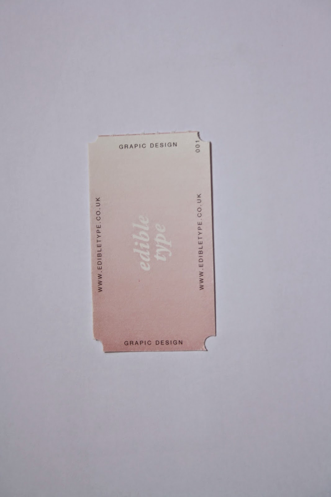


After asking some of my peers for their feedback, the decision was made to use the tickets printed on the pink stock.
This decision influenced the rest of the design process. I made the decision to include this pink stock throughout the project.
INVITATION
For the invitation I used a very similar layout to the poster.


The only difference to the poster was that the majority of the information was on the reverse and there was no white boarder.
I chose not to use the coloured stock as I wanted this to be a more clean and sophisticated part of the project.
POSTCARDS
Using the imagery I had already sourced, I design a set of postcards to be given out at the event as a momento.


The reverse of the postcards just contained some information about the exhibition.
The back would be printed on the pink stock and then duplexed to the images (printed on card)
WRAPPING PAPER
The wrapping paper was to be used to wrap up the food at the event.
The paper design was just a repeat pattern of the logotype.

ADVERTISEMENT
As the poster was only to be used internally there was no external promotion. As part of the project, I decided to design a advertisement that could be used in various different situations.

I mocked this up in a newspaper to shoe situation.

WEBSITE
I though that the website should be simple and informative. It could be a place to see information on the exhibition as well as images of the entrees.
I thought the most appropriate form of website was a long scroll site.
I designed several pages of the website.


I thought the website should work across all platforms so produced some images of how it would look as a responsive site on an ipad and an iphone.


I mocked up the images.

No comments:
Post a Comment